
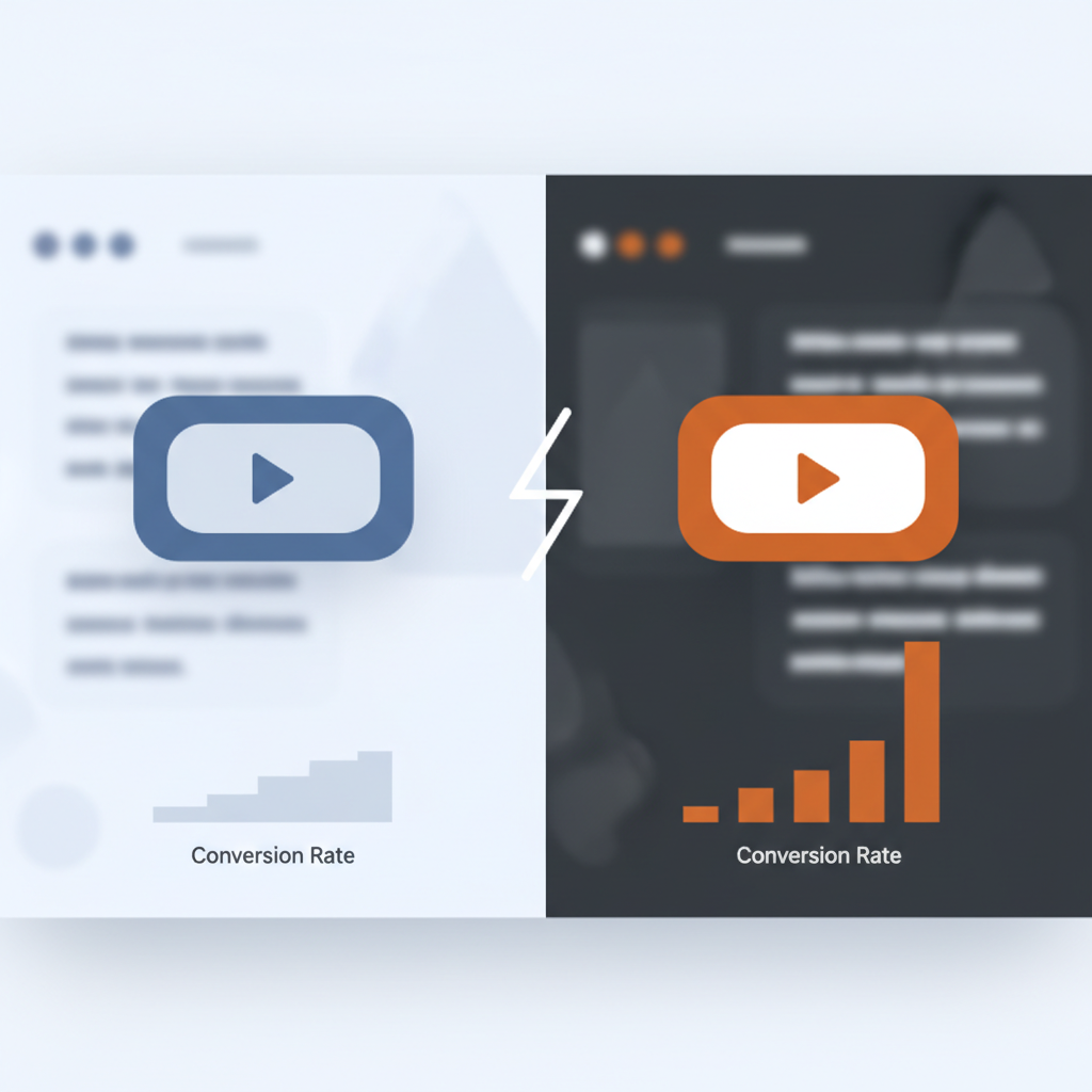
A transparent button with a thin one-pixel border, floating over a hero image, was a genuine design trend for years: minimal, sophisticated, the kind of choice that looks great in a portfolio screenshot. It’s also, according to eye-tracking research on the pattern, one of the more reliable ways to make a visitor miss the exact element a page most needs them to click. A ghost button, sometimes called an outline button, strips away solid fill entirely, leaving just a border and text, which trades away the one job a button actually has: being unmistakably identifiable as clickable in under a second of unconscious scanning.
The visual logic behind the trend made sense for its era of flat design: less visual weight, more restraint, a button that doesn’t fight the imagery around it. What that design language quietly sacrificed was recognition speed, and recognition speed is the whole point of a button.
Why Removing Fill Removes Recognition
Human visual processing identifies interactive elements through salience: contrast, depth, a shape that reads as “this is a thing you can press” before any conscious reading happens. A solid-fill button with real color contrast against its background gets recognized almost instantly, without the visitor consciously registering “that’s a button” as a separate thought. Strip the fill away and that recognition has to happen through slower, more deliberate visual processing: parsing a thin outline against a busy or textured background, distinguishing it from decorative borders or unrelated graphic elements nearby.
That difference sounds small in isolation, and on a single page it might be. Across an entire conversion funnel, checkout flow, signup form, pricing page, that repeated moment of hesitation compounds into measurable friction. The research on this describes it as micro-hesitation: not a visitor who gives up entirely, but one whose forward momentum through a task gets interrupted at exactly the moment it needed to stay smooth.
The Pogo-Sticking Problem
There’s a specific, observable behavior pattern tied to this: visitors who scan a page, fail to register the primary action clearly, and bounce back and forth between sections looking for it, sometimes described as pogo-sticking. It shows up in analytics as unusually high back-and-forth navigation between a landing page and the page it links from, or as time-on-page that looks like engagement but is really confusion. A visitor who can’t quickly locate the intended next step doesn’t necessarily leave immediately; they often hunt for it first, and that hunting is friction a business is paying for in lower conversion rates without an obvious diagnostic pointing at the cause.
This matters more for a small business site or online store than it might for a large brand with near-unlimited traffic to spare, because every visitor represents real acquisition cost, whether that’s an ad click, an SEO ranking, or a referral. A design choice that costs even a few percentage points of conversion on the button that matters most (add to cart, submit, sign up) is a direct, compounding cost against traffic that was expensive to earn in the first place.
The Accessibility Problem Hiding Inside the Design Trend
Ghost buttons have a contrast problem that goes beyond aesthetics into genuine accessibility failure. WCAG contrast requirements exist specifically to ensure text and interactive elements remain legible for visitors with low vision, and a thin-bordered, unfilled button sitting over a photographic background routinely fails those requirements, because its legibility depends entirely on what happens to be behind it at any given moment. A ghost button that reads clearly over a dark section of a hero image can become nearly invisible over a lighter section of the same image, and that inconsistency is baked into the pattern itself, not a one-off implementation mistake.
This gets worse on real-world devices rather than a designer’s calibrated monitor: high-glare phone screens outdoors, older or lower-quality displays, browser zoom levels that shift how an image crops behind a button. A pattern that looks intentional and minimal in a design file can become functionally invisible in the actual conditions most visitors are browsing under, which is a genuinely different failure mode than a button that’s merely less prominent than ideal.
Ghost Buttons in WordPress and WooCommerce Themes
This isn’t a problem confined to custom-built sites. A large share of popular WordPress and WooCommerce themes ship ghost-button styling as a default for hero sections, category banners, and sometimes even the primary “Add to Cart” button on product pages, because the pattern was fashionable when many of those themes were designed and the default was never revisited. A store owner who picked a theme for its layout or its price never necessarily chose the ghost-button style deliberately; it came bundled in, and it’s easy to never notice because it looks fine on a design preview and only becomes a real problem once actual customers, on actual devices, in actual lighting, are trying to check out.
Checking for this doesn’t require design skills, just a specific look: open the theme customizer or the page builder’s button block settings and check whether the button styling uses a background color or only a border. Most modern WordPress page builders make this a one-setting change, adding a solid background color and confirming contrast against the surrounding page, without touching anything else about the site’s layout or branding. For a WooCommerce store specifically, the checkout and add-to-cart buttons are worth checking first, since those carry the most direct revenue impact of any button on the site.
What Fixes It
The fix is a solid fill with real, measured contrast against its background, and enough visual depth, a subtle shadow, a slightly raised appearance, or just confident color contrast, to signal “interactive” before a visitor consciously parses the page. This doesn’t require abandoning a clean, modern aesthetic or reverting to a decade-old skeuomorphic style; a flat, solid-color button with strong contrast against its surroundings does the job without any retro visual baggage. The specific style matters far less than the underlying requirement: an unmistakable, consistently legible signal that says “this is the thing to click,” regardless of what background happens to sit behind it.
For any page carrying real commercial weight, a product page, a pricing page, a checkout step, this is worth treating as a genuine audit item rather than a design preference to leave alone because it currently looks fine. Pull up the page’s primary call-to-action button and ask, honestly, whether it would still be immediately obvious as clickable with the surrounding branding and imagery removed, just the button on a plain background. If the answer depends on exactly which part of a photo happens to sit behind it, that’s the ghost-button failure mode in practice, whether or not the button was consciously designed with a transparent fill.
Why This Keeps Happening With New Design Trends
Ghost buttons are a useful case study for a pattern that shows up repeatedly in web design: a trend spreads because it looks sophisticated in isolation, on a portfolio site or a design showcase, and gets adopted broadly before anyone measures what it does to real user behavior at scale. Minimalism and restraint are legitimate design values, but they have a real cost when applied to the specific elements a page depends on for revenue. The primary call-to-action on any commercially important page is not the place to prioritize subtlety over clarity, and the eye-tracking research behind the ghost-button critique is a concrete reminder that “looks clean” and “converts well” are sometimes directly opposed choices, not the same goal described two different ways.