
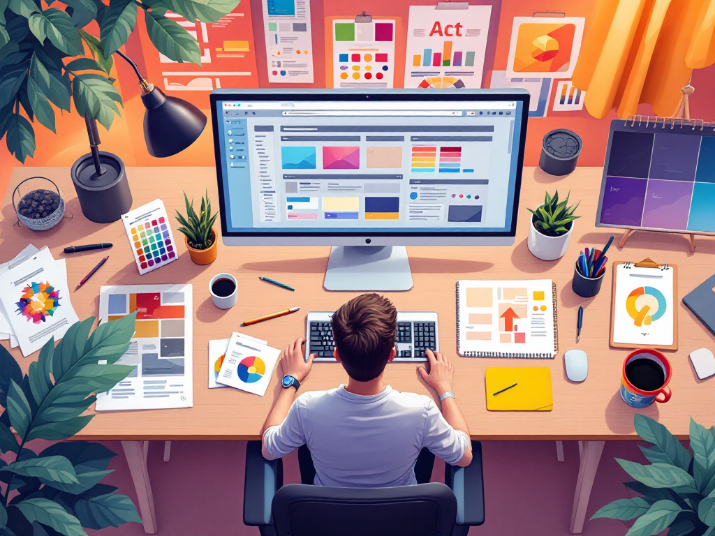
What AI graphic design tools are actually good for in commercial work, building visual consistency, and the commercial-use rights to check.
Table of Contents
AI art tools have genuinely changed the economics of commercial graphic design: what used to require hiring a designer or buying stock imagery can often be generated directly, in minutes, at a fraction of the cost. That’s a real shift, but it comes with real caveats worth knowing before building a brand’s visual identity around it.
What AI Art Tools Are Actually Good For
Rapid concepting and exploring visual directions before committing to one is where AI art tools shine, generating a dozen variations on a theme is fast enough to actually iterate rather than settling on the first idea. Backgrounds, textures, and supporting visual elements that don’t need to be pixel-precise on a message work well too. What’s weaker: anything requiring exact brand consistency across many assets (AI tools are inconsistent between generations unless carefully constrained), and anything where the output needs to match a very specific existing style rather than a general aesthetic direction.
Building a Consistent Visual Identity
Consistency is what separates a professional-looking brand from a pile of disconnected images, whether AI-generated or not. A defined color palette, consistent typography, and a specific style direction (used as a written brief, not just “make it look good”) applied across every asset is what makes a visual identity read as intentional rather than assembled from whatever looked good at the time.
Commercial Use: What Actually Matters
Rights around AI-generated images for commercial use vary by tool and are genuinely still evolving legally, this isn’t settled ground the way traditional stock photo licensing is. Before using AI-generated art commercially: check the specific tool’s terms of service for commercial use rights, not a general assumption about how AI art works. Some tools grant full commercial rights on paid plans; others have restrictions or require attribution.
When a project has real legal exposure (a paid ad campaign, packaging, anything with real commercial weight), verifying the specific license terms of the specific tool used is worth the ten minutes it takes, rather than assuming. This connects directly to the broader question of what AI-generated content can actually be protected by copyright in the first place, worth reading alongside this if a brand’s visual identity is being built substantially around AI-generated art.
A Practical Workflow
Define the brand direction first (palette, style references, mood) as a written brief before generating anything, generating without direction produces inconsistent, generic results. Generate multiple variations rather than accepting the first output, the difference between an average result and a genuinely good one is usually a handful of iterations. Edit and refine in a standard image editor rather than treating the AI output as final, minor adjustments (color correction, cropping, composition tweaks) usually improve a generated image more than another round of generation would.
Where a Human Designer Still Earns Their Fee
The honest limit of AI-generated visuals is anywhere brand recognition depends on exact, deliberate consistency, a logo, a primary brand mark, packaging that needs to match precisely across every SKU. Generating supporting content around an established brand identity is a good AI use case; generating the core identity itself, the thing everything else needs to match exactly, is usually still worth a human designer’s judgment, since that’s the one piece of visual work an inconsistent generation process can’t safely produce.
A Checklist Before Publishing AI Art
A few checks take minutes and prevent most problems with AI art in commercial work:
- Read the tool’s terms for commercial use, rather than assuming.
- Make sure the image does not resemble a real person, a trademark, or a recognizable brand.
- Save the prompt, settings, and original file so you can reproduce or explain it later.
- View the image at full size and look for strange hands, text, or artifacts.
- Add useful alt text for accessibility and search.
AI Art Mistakes to Avoid
The most common mistakes are treating the first output as final, mixing styles so a brand looks inconsistent, and relying on AI art for the pieces where precision matters most, such as logos and packaging. Another is forgetting to check the license until after the campaign has launched. Use AI art for concepting and supporting visuals, keep a written style brief, and bring in a designer where exactness is essential.
Getting Started
Start with one specific, recurring need, social media graphics or blog headers are a reasonable first case, and build a consistent process for it before expanding to other asset types.
Key Takeaways on AI Graphic Design
- AI graphic design works best for concepting and supporting visuals, not for exact brand marks.
- Write a style brief before starting AI graphic design so results stay consistent.
- Check the tool’s commercial-use terms before publishing any AI graphic design work.
Related reading: Faceless Video Content: What Actually Makes It Work and AI Content Ownership: What’s Actually Protected Under US Copyright Law.
Further reading: U.S. Copyright Office: copyright and artificial intelligence.